The Blonde Apartments
Visual identityPaying homage to a Pop Art icon
Building on their continued success in downtown Cincinnati, North American Properties worked to diversify their portfolio of residential developments with a new 14-story tower geared towards young professionals ready to experience an urban lifestyle. Looking for innovative ways to keep the properties affordable, North American Properties decided to dedicate over 50% of the building to micro-units—a new concept for the Cincinnati market.
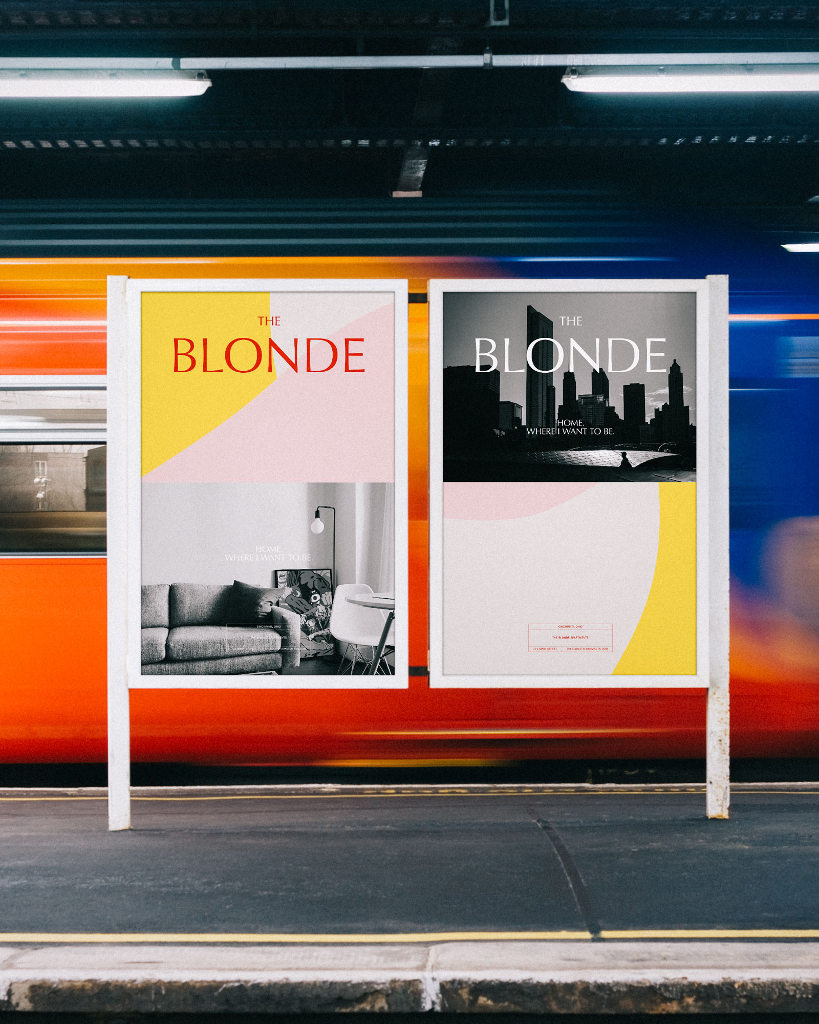
Marketing 450 sq ft micro-units presented a unique challenge for North American Properties, as they’re accustomed to marketing large, luxury residences. Taking inspiration from the building’s proximity to cultural institutions, the urban environment, and downtown lifestyle, we named the building “The Blonde” as a reference to Cincinnati-native and Pop Art icon Tom Wesselmann. The visual identity is an homage to his famous works, combining colors and shapes found in his art with a flexible design system and bespoke typeface.
When The Blonde was set to open in Fall 2020, the initial brand launch had already helped to amass a wait list for occupancy.
Designed at C-90.